To get started, rendering intents sounds scientific, but really what we’re talking about here is what happens to red when printing.
Monitors display colors using RGB (Red, Green, and Blue). They are very good at displaying these colors, while printers use CMYK (Cyan, Magenta, Yellow, and Black) and are much better at printing these colors.
Correspondingly, printers are not so good at Red, Green, and Blue and monitors are not as good at displaying Cyan, Magenta, Yellow, and Black.

From left to right:
- RGB red: Typical monitor
- SWOP red: Printed red (simulated) on an offset process
- DTG red: Printed direct to garment (smaller color range)
Color gamut is the term used to describe the color range of a device or the colors that it can produce.
You would describe the Red as an out of gamut color in DTG as it cannot be printed with the ink / substrate combination, at least not close to the red you see on a screen.
When converting colors between color spaces, you have four options for gamut mapping that fall into two categories, and affect how all colors are printed. For small color gamuts, such as DTG, this can have a very big effect.
Quick Tip
When going from a large gamut (monitor) to a small gamut (DTG):
- For graphics – use Relative or Absolute for a better color match and more saturation (photos would appear more posterized with less detail).
- For photos – use Perceptual or Saturation for more detail in the image (graphics would appear less saturated or colorful).
Colorimetric
Colorimetric rendering does not compress the Lab color space when converting the colors to the printer’s color space. Colors that exist in the printers color space will be reproduced exactly and any colors that are outside the printer’s gamut are converted to within the boundary of the printer’s gamut.
Absolute and Relative are Colorimetric Rendering Intents
Absolute renders out of gamut colors to the boundary of the printer’s gamut and makes no adjustment for the white point of the media.
Relative renders out of gamut colors, preserving the lightness and hue of the color, and adjusting for the white of the media.
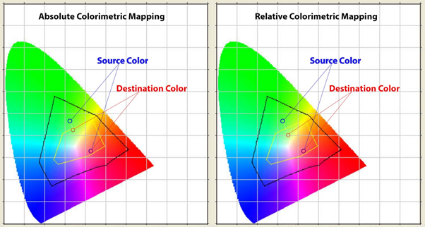
In the above images, the black area is the source (monitor) and the yellow area is the destination (printer).
Perceptual
Perceptual rendering intents compress the entire color space into the printer’s color space while maintaining the relationship between all the colors and adjusting for both the white point of the media and the black point of the printer’s gamut. The human eye is more sensitive to the relationship between colors than the accuracy of colors, and since this method preserves the relationship of the colors, people are less likely to see that the colors have been altered.
The exact Lab color reproduction is not possible, but the impression of the original image is preserved, gradients will be smooth (no sudden changes).
Perceptual and Saturation are both Perceptual rendering intents.
Saturation differs from Perceptual in that all colors are scaled while preserving the saturation and at the expense of the hue.
