This wizard controls how much white to use under black and very dark areas. In most cases with digital printing, you’ll need to add white. It can help add opacity for UV and reduce fading and cracking during washing for apparel using DTG and DTF printing processes.
 The wizard has 2 printing steps. First, it will print variations of the amount of white ink under black areas. This enables you to select the best setting for your setup. The second step prints variations of the amount of white ink in areas where the shirt will partly show through. This helps you determine the best setting. For this reason it’s a good idea to work with a file that has a fade or transparency.
To start:
- Go to the “Queue” menu and select “Setup how much white to use under black”. This will open the dialog.
- Select the page size of your print bed.
- Choose the graphic with which you would like to perform the print variations.
- Finally, set the size you would like to print the graphic and click “Next”.
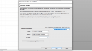
In the next dialog, select a Minimum and Maximum range of white under black for the first test print. Next, click “Print underbase strength chart”.
You will now see jobs with varying amounts of white under black from 0% white to 100% white. It’s good practice to print the samples to get a real world indication of which setting would be best. Right click on one of the jobs and select “Print” from the menu or click on the print icon at the top.
With DTG, it greatly depends on the printer, the shirt and the pre-treatment. Ask the manufacturer for advice.
For DTF, the powder glue only sticks to the white ink, so the white under black needs to be quite high (60-80%) . After printing the samples, reviewing the results, and deciding on the best setting, go back to the “Set how much white to use under black” dialog, type the value in the preferred underbase strength value or select from the dropdown list, and click “Next”.
The second part of the Wizard is to fine tune the white levels and the amount of underbase white used in the transparent areas.
You can choose from 4 different charts:
- Strong white midtones-shadows.
- Medium plus white midtones-shadows.
- Medium white midtones-shadows.
- Light white midtones-shadows.
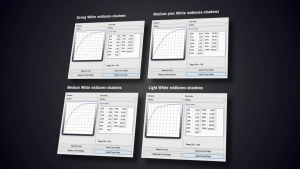 These white separation curves are used and here you see that in the midtones and shadows, the white is reduced.
You should print the variations. Click “Print white level chart” to review your best setting. The chart has created 4 options for the medium white midtones-shadows ink chart, A3, B3, C3 and D3. As with the underbase strength chart, print these out and choose the setting you want to use. These are the white separation curves used for the print. They have different start points for printing white.
Once you’ve decided which value to use, select it from the drop down list on the right for the preferred white level from the chart. If you are not happy with the medium white midtones-shadows ink chart, try one of the others settings.
View Raw Data gives an idea how the different settings will look. As before, you should print the design to accurately see the difference. Printing out multiple designs can help achieve the best settings. Print these out as previously explained and click “Next”.
To finish the “Set how much white to use under black” Wizard, you will choose from 3 options:
- Only apply to the queue.
- Apply to current print mode.
- Create a new printmode.
We recommend you create a new printmode. Click “Finish” to close the wizard. The new printmode has now been added with the chosen white under black setting.
To follow along with this wizard or for more information, check out our YouTube video below: